November 9, 2018Comments are off for this post.

Leadership

It is hard to believe I have been a designer for almost twenty years. Over that time, I am proud to say I have consistently made my way up the industry ladder, stopping to take in the view on every floor.

From my early days as a junior designer to the last few years where I have held the title of design director. One thing has always been clear to me. Design is a team sport and we'll only get where we want to go if we are all there for each other.

When recently asked by an industry colleague, what I think it takes to be a good leader. I began to really think and hone in on my core philosophies and personal approach. Realizing it came down to a few key points.

Trust your team

Trust is everything. Yes, trust has to be earned. However, it's a leader's job to inspire and facilitate that trust in a team environment. This allows everyone to work efficiently together, accomplish mutual goals, and maintain a good morale while doing so. With trust, a leader can let go of day-to-day details and focus on maintaining the overall quality of work while thinking about the big picture.

Hire people that are better than you

If you employ people you consider more talented than you, you are more likely to listen to their thoughts and ideas, and this is the best way to expand on your own capabilities and build the core strength of your organization.

Keep your team continuously curious

Breeding curiosity keeps people on their toes and readies them to take on new challenges. With the speed in which everything changes today, a team must be agile. Always ready to look at the problems they encounter from different points of view.

Don't be afraid to call people on their bullshit

It's a hard thing to do and can sometimes be seen as a forceful act and disrespectful. But letting people know that you will hold them accountable by having them explain their decisions encourages them think about a problem from many different angles. Helping them to see the big picture and provide the best possible solutions.

Ask your team to only give 80%

The other 20% needs to belong to them for research and personal exploration. The greatest thing designers bring to the table is the ability to see the future. Figuring out where design is going next is much more important than becoming an expert on where it is now. Give your team space to experiment, fail, and learn from their experiences, peers and other industry leaders. The return on investment will be 110%.

Prepare your designers for their next job

As a design leader, it’s your responsibility to develop your team’s talent and help grow their careers. Keeping them down will only hurt their confidence and cause them to second-guess their decisions. Check in frequently and work with them to set achievable goals that help keep them inspired and motivated.

Create a safe place for people to fail

Failure is only failure if we don’t learn from it. And learning from mistakes is a part of professional growth. If your team doesn’t feel safe taking chances. How will they push the boundaries, move outside of their comfort zone and do their best work.

May 27, 2014Comments are off for this post.

The basement bar is just an improved hamburger menu

Recently, an article by Luis Abreu entitled “Why and How to avoid Hamburger Menus” surfaced within my personal Twitter feed. As a regular advocate for this type of navigation, the title immediately set off alarm bells inside my head, begging the question:

Have I been recommending the wrong website navigation experience to our clients and their customers all this time?

After reading the article, I immediately did what any good person who thinks they have wronged the world does. I began to research the heck out of it.

What I constantly found, was that while everyone could quickly write about what isn’t working for online navigation, no one could quite put their finger on what the right solution should be.

The best answer I found was the recommendation of the so-called “basement bar.”

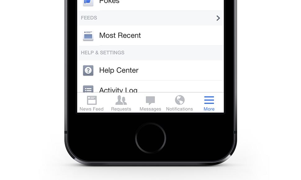
For those unfamiliar, this is the treatment Facebook is currently using within their mobile app. It positions a five tab navigation bar along the bottom of the screen that allows the user to toggle between Facebook’s key sections — News Feed, Requests, Messages and Notifications.

However, as Evan Dinsmore, designer at Shopify writes here (and I completely agree,) “A lot of times you can’t break down the IA enough to fit in a tab bar.”

And that’s why Facebook reserved the final spot within their tab bar for a “more” button. (Which in my opinion still constitutes, you guessed it, a Hamburger Menu!)

This leads to why I felt this piece needed to be written. Hamburger Menu and Basement Bar naming aside, what we as UX designers have to understand with any solution we propose is that some clients will never be able to narrow their IA down to four navigation items. This is a crucial point as we move forward with trying to improve the online navigation experience.

What the Facebook example shows is that we can improve on the original Hamburger Menu option by working directly with our clients to highlight a few key entry-points that can help drive the user to where we think they would want to go more quickly.

The good news? This idea can be completely scalable. For example, a desktop version could highlight eight entry points, the mobile version only four, both providing a similar user experience while training the user to know where to look for any additional sections.

But we don’t have a cool name for that yet…

February 2, 2014Comments are off for this post.

Page weight

Since 2009 the average page weight on the web has grown aggressively from 320KB to 1.3MB.

Granted, that number doesn't seem large when we think about viewing it on our North American mobile devices over hi-speed 4G and LTE bandwidth connections. But let's stop and think for a second about emerging markets such as Africa, India and Asia.

Of the 7 billion mobile subscriptions in these markets, 60% are on Edge (3G) and CDMA (2G) networks*. And by 2017, of an estimated 9 billion, 36% will still be on those same networks*.

That means loading a web page there can take a considerably larger amount of time. For example, in India where even the possibility of 3G coverage is spotty and largely confined to bigger cities. Downloading a 1 MB photo can take up to 25 seconds**.

With the number of mobile users in the developing world set to overtake the developed world for the first time in 2014***. We now must pay even closer attention to bandwidth optimization at the beginning of every online project.

I believe going forward, pages should weigh no more than 300kb and take no longer than six seconds to load over a sub-3G connection. As Chris Zacharias, founder of imgix wrote in his article page weight matters, "by keeping client-side code small and lightweight, you can open products up to new markets."

Developers are even starting to question the possibility of developing “high-end” and “low-end” versions of our responsive websites, or the idea of a total page-size ‘budget.’ Say we want a huge header image at the top of a page?  Sure. But that’s 100KB of our budget used up, so we'll have to lose a weight or two of a web font to bring things back under the limit.

What I am really hoping for is the idea Ethan Marcotte shared (at An Event Apart, San Francisco) allowing people to set preferences on their mobile devices for image quality and content, based on usage plans and bandwidth speeds. Giving control back to the people who understand the appetite of their mobile devices best.

References
*Estimates via Ericsson 2012 Traffic and Market Report
**http://www.ehow.com/about_6585356_comparison-3g-768kb-speed-internet.html
***http://www.reuters.com/article/2013/07/23/us-smartphones-saturation-idUSBRE96M0A220130723

January 14, 2014Comments are off for this post.

Iteration

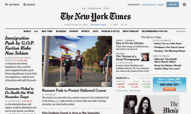
Today the New York Times officially announced the redesign of their website—a project they’ve been working on for the past several months. While there will definitely be commentary around it's launch and good vs. bad changes, there is one key feature we feel all businesses looking to rebuild their websites in the near future should pay special attention to: they’ve engineered evolution into their site design.

"We have completely replatformed the whole back-end technology system so that we can get out of the business of doing redesigns," Denise Warren executive vice president, digital products and services group at The New York Times told Fast Company.

On the same note, I recently attended An Event Apart, a web conference for designers held in San Francisco. One of the key points raised by multiple well-known speakers at the event (including Jeffrey Zeldman, Luke Wroblewski, Ethan Marcotte and Karen McCrae) was the idea of preparing for online iteration. We believe this supports the idea that websites are no longer “corporate brochures”, but organic organizational tools—to help support and grow business and connect with customers. Not only are websites never perfect, but they are often out of date at launch. We must build a more modular approach that will easily evolve as priorities and messages change.

For the New York Times, this focus on site evolution allows them to be flexible. "We can continually iterate on the site and take advantages of the trends as we see them happening,rather than having to do a big unveil," Warren explains. As a result, she says, readers will see more incremental changes over time, rather than a big unveil a few years down the line.

At Zync, we’re currently helping clients like speakers.ca and olympic.ca evolve their sites on an ongoing basis. Right from the initial planning stages, we understood their content would need to be adjusted—and we built websites and Content Management Systems that were prepared for that. We’re embracing evolution and future-proofing our clients’ sites.

January 5, 2014Comments are off for this post.

Accessibility

Recently I have started receiving a number of inquiries regarding the new mandatory web accessibility standards in Ontario and how they will effect both new and existing websites.

As of January 1, 2014 under the Accessibility for Ontarians with Disabilities Act (AODA), all private and non-profit organizations with 50 or more employees and all public sector organizations will need to make their websites accessible or face substantial fines.

Here is what I can tell you.

Beginning January 1, 2014:
If you launch a new public website or your existing site undergoes a significant refresh, the site and any of its web content published after January 1, 2012, must conform to the World Wide Web Consortium Web Content Accessibility Guidelines (WCAG) 2.0, Level A.

According to the Ministry of Community and Social Services, a significant refresh is defined as “changing more than 50% of the content, design or technology of the website.”

In order to meet WCAG 2.0, Level A, an organization’s website must:

  • Provide captions and text alternatives for images and multimedia
  • Use strong contrast between text and background, and make text resizing available
  • Create content that can be presented using assistive technologies (such as screen readers) without losing meaning
  • Use structured content and make it keyboard accessible
  • Avoid CAPTCHAs (user challenges involving distorted letterforms) and give users enough time to read and use content
  • Avoid time limits when asking users to provide a response or information
  • Avoid blinking images
  • Avoid the use of colour indicators
  • Help users find and navigate content by making links specific (not ‘click here’)
  • Help users avoid and correct mistakes by making error messages specific
  • Make tables and charts accessible to assistive technology.

The Government of Ontario has also produced a guide to help ensure your web property meets accessibility standards. The full PDF can be viewed at this link.

In the document, you will also find mention of the following:

Beginning January 1, 2021:
All public websites and all web content on those sites published after January 1, 2012, must conform with WCAG 2.0 Level AA, other than providing captions on live videos or audio descriptions for pre-recorded videos.

I hope this brief synopsis will help you understand the new standards and things to come. However if you have any further questions please do not hesitate to contact me.

November 12, 2013Comments are off for this post.

Content First

The primary reason people go online is to consume content. To read news, look at status updates, view photos, read restaurant reviews, look at credit card spending habits — always to learn about something that interests them.

So why aren't companies putting content first when building new websites?

When it comes to website planning, we already know that we should focus on user experience and apply the best web technologies to meet the needs of our user. However, what’s missing is the importance of content and the creation of a comprehensive and unified strategy surrounding it.

Ideally, before a web project moves from site map approval into the wireframe/prototyping stage, the content should be completely mapped out. Understanding content types will help the UX team use the appropriate tools (placement on the page, visuals, type size etc.) to get the messages out.

Currently, we are seeing the discussion about web content often limited to who will be in charge of it. In the best situations there may also be talk around SEO and the inclusion of social media feeds. Most of the time, that's it. And that is not enough.

Questions need to be asked around the purpose of the website and what makes the company different. Is there existing content? Does the copy need to updated, edited, or in most situations dramatically condensed? After these questions are answered, all the different content types that will live on the website should be analyzed for a structured taxonomy that will in turn drive functionality.

This gives the website the ability to dynamically generate related information across all pages, allowing a company to "cross-sell" material the user might never have known existed.

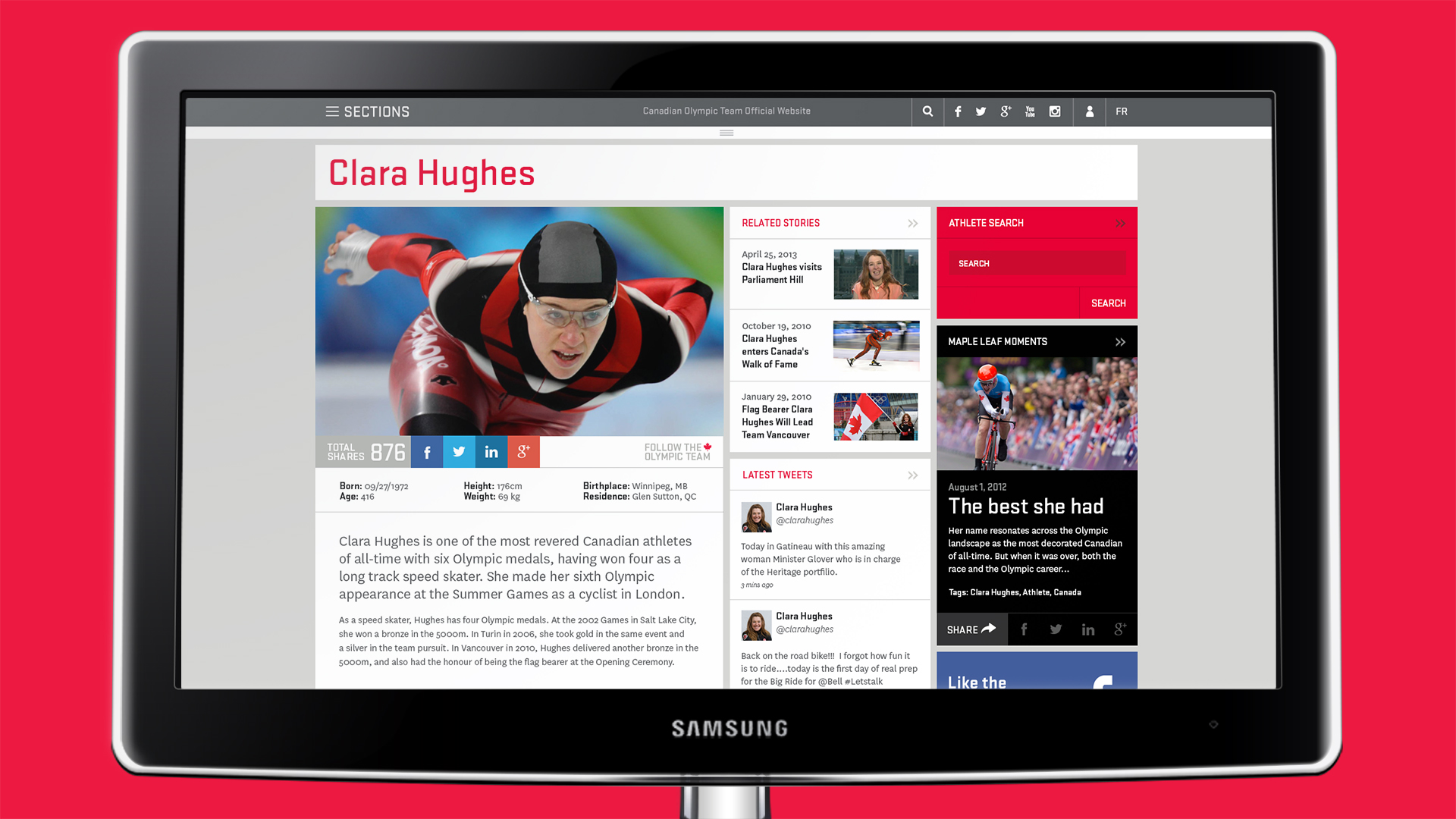
An example of this can be seen within the @zyncagency recent rebuild of the Canadian Olympic Committee responsive website: Olympic.ca. Users immediately get access to information about the Sochi 2014 Winter Games, the athletes, the official twitter feed, as well as related stories and videos. A keyword tagging system offers up relevant dynamic content throughout the site based what the user is looking at.

Today, Websites are dynamic and fresh. They need to be easy for people to update with new content on a regular basis. With a well thought out content strategy, websites can meet the needs of the user and keep them coming back for more.

September 24, 2012Comments are off for this post.

Mobile first

Smartphones, although relatively new, have made significant impacts on our professional and personal lives. This mobile tool has completely redefined our daily routines, behaviours and personalities. There is a widespread addition to our mobile devices—many can’t even go an hour without checking their smartphone for an e-mail, text, Tweet or Facebook update.

The Addiction
A recent study found that 1 in 4 people check their mobile device every 30 minutes, while 1 in 5 check it every 10 minutes. Twice as many people would pick their phone over their lunch if forced to make the choice and three-quarters of 25-to-29-year-olds actually sleep with their phones.

Smartphones and mobile devices aren’t phenomena anymore—they are ingrained elements of who we are today. There is this unbreakable connection that we have to these devices—whether it is for work or for pleasure—we rely on them to make decisions, educate ourselves and find out about the world around us.

Responding to the Trend
Companies today are beginning to understand the importance of “going mobile” when it comes to website strategy and design. For instance, the responsive website design trend exploded because more and more brands were realizing the benefits an adjustable website had in regards to content, engagement and business objectives. Responsive website design is still fairly new, but it is becoming more of a necessity, regardless of the industry a company operates in.

Mobile First
The new industry adage of “mobile first” reflects how companies are changing how they perceive website design. Traditionally, it was all about the desktop—the static website that achieved what it needed to, without needing to worry about smartphones, tablets and other devices.

Take for instance USA Today, who completely broke the proverbial mold when they redesigned their website to look very close to an iPad app. The company’s president and publisher, Larry Kramer, noted that the idea was to reinvigorate the value of print media while introducing new digital products. This entire redesign took advantage of the iPad app’s addictive and intuitive design and created something that inverted the website development process.

USA Today not only started with thinking “mobile first”, they used the user-experience, design and functionality of the mobile space to inform their entire redesign strategy.

Looking Forward
At a very early stage, we embraced the pervasiveness of mobile use from a brand and marketing perspective. It isn’t enough to think about mobile after the fact. At that point, it’s too late. We as designers and strategists believe that the entire user-experience—from desktop to mobile to tablet—must be thought about and designed around.

The expectations of an audience today are vastly different than a decade ago. Internet browsing and mobile use has completely changed how people consume information, make decisions about products, or connect with a brand. Acknowledging this trend is essential from a website design perspective. In order for a company’s brand to truly connect with their audience, we must create an experience that meets those expectations.

November 14, 2011Comments are off for this post.

The World is going mobile

In 2010, over 50% of all internet access was through a handheld device -  and every month, another 2.5% of people are converting to the use of smart phones. By the end of 2011, more people will be using smart phones instead of cellphones and by 2014 mobile internet will take over desktop internet usage.

The world is going mobile. Computing is now on-the-go - people are now accessing data on their smart phones, not waiting until they sit down at a desk. In fact, over 35% of iPhone and Android owners access their devices before getting out of bed in the morning. Desktop computers are becoming extinct, with laptops, tablets and most of all smart phones taking over.

These devices are changing the way we do business and interact because they give people the flexibility to access the internet wherever they are. Right now, half of all local searches are performed on mobile devices, with most of them leading to immediate action. And it’s not just people on-the-go; studies have shown that a majority of current mobile internet browsing is done at home. If you are a business pushing out content or trying to make a sale, and you don't have a website that reacts to the functionality of a mobile device, you need to start thinking about your mobile strategy.

In a recent article, we highlighted the importance of Responsive Web Design and how it can be developed to work across multiple devices while sharing the same back-end. Mobile devices are now a key factor in all websites we design, with the smartphone being the most limiting in terms of screen size and load time. So now, bandwidth optimization (loading time) and hierarchy of information need to play an even greater role in content development and design.

Speaking of content, research shows that we are now a generation of scanners - we need to omit useless words even more than ever before, highlighting keywords and using meaningful subheads and bulleted lists wherever possible. Paragraphs are best when the text is limited to one idea and using the inverted pyramid style for writing, starting with the conclusion first. Web users are busy, they want the straight facts and they want to be able to get them easily.

These ideas are not new, but they are becoming more crucial when designing and developing content for the internet, especially in a time when the world is going mobile.

November 9, 2011No Comments

Zync is responsive

In the field of web design and development, we are at a point where it is impractical – financially and otherwise – for any business to attempt to keep up with the seemingly endless amount of new devices coming to market.

So, we started asking questions: Should a business suffer the consequences of alienating users of one device for the benefit of gaining them on another? Or, must we continuously develop website versions to cover the requirements of each device?

We knew there had to be a better solution. This challenge, and the answers discovered, led to an approach called Responsive Web Design (a term that originated in an article by Ethan Marcotte) – instead of a device reacting to a website, the website can now react to the device. As users switch from one type of hardware (desktop, laptop, tablet or smartphone) to another, the website automatically adjusts itself to accommodate for resolution, image size and scripting abilities. This functionality is accomplished through a mix of flexible grids and layouts, images and an intelligent use of CSS media queries. We now have the technology to automatically respond to the user’s preferences, eliminating the need for a different design and development phase for each new gadget on the market. It’s a much more cost-effective and practical solution.

In order to fully engage our team in Responsive Web Design – and our strong belief in this approach – Zync recently overhauled our own website at zync.ca to take full advantage of HTML5 and its capabilities. Depending on what type of device you use, you’ll notice some subtle differences: adjustments to the navigation structure, column widths, type size and the ability to control the site by mouse or by touch. We even made sure to take full advantage of the devices – for example, elevating the directional map to the home screen of the smartphone version to recognize it’s importance when our users are on-the-go. All elements are customized to enhance the experience and allow for optimal viewing on any device – even though it is all part of a single website.

The growth of new products is not expected to slow down anytime soon. And, I believe in creating websites that are future-ready, now. Understanding and being able to apply responsive design is key to operating in this reality. Through researching the market and building our own site, we are now able to provide our clients solutions that keep them current and relevant – and save them significantly in their online budgets.

October 20, 2011Comments are off for this post.

Mobile vs. Native apps

With the current rise in development of Responsive Websites, eliminating the need to develop multiple versions of Websites for different computer devices, I have been questioning whether Web-based applications will soon dethrone native apps?

If we take a look at the current home-screen of any smartphone or tablet, you are likely seeing native apps from some well-known brands such as Facebook, Twitter, and Google, to name just a few. And you may also see some from companies such as Amazon, Target, and eBay, which sell a lot of products via the Web.

Now I am sure these sites and companies have access to suppliers who know how to build effective Websites using the latest and greatest Web technologies. I am also sure the mobile device's browser supports HTML5 markup with CSS3 styling, probably powered by a fast JavaScript engine. So why is there a need for these native apps instead of Web pages that can do the same thing?

The fact is the mobile Web market is much larger than native applications markets. Like Responsive Web Design, coding for the mobile Web would allow app developers to reach a broader audience on multiple devices and platforms in a single stroke. Platforms like iPhone, Android and Windows Mobile (which all use unique languages and techniques to develop applications) actually represent only a fraction of the overall mobile device market, while Web apps are accessible from a much larger number of handsets. Championing Web apps would also allow developers to use HTML, CSS and JavaScript going forward instead of learning new languages to code native applications. And let's not forget the 30% cut on revenue Apple takes to sell your app in their store, not to mention complete ownership of all accumulated subscriber data.

These all seem like really crucial points.

Unfortunately for Web app fans, the biggest problem is their performance. Native apps are streamlined to run as efficiently as they can on the device they are designed for – while Web apps are limited by browser constraints. Another issue, while coding for the internet may be simpler than creating native apps, the native platforms allow the apps to take advantage of the device's features and functions. From a user perspective, this is more appealing because they would rather use an app that felt like it belonged on the mobile platform rather than use a Web app that seems shoehorned onto the device through HTML. And lastly is lack of exposure.

Everyone appreciates the need for an app store. It provides a one-stop shop to make a single-click purchase (providing your credit card is already on file) of any app for your device. The thought of having to visit each company's Website to purchase their Web app seems very inefficient. Yet one company has already decided to make the leap. Recently the Financial Times declined to make changes required by Apple’s terms thereby removing their presence from the app store. Instead it’s been directing its subscribers to an iOS-specific, HTML5-based Web app that it’s developed. Only time will tell us who wins this battle, though I am rooting for the Financial Times.

In the end, I think the question still remains - will mobile Web applications one day outpace native apps? I think so. Like Responsive Web Design, it just seems logical to develop one version of the application that will work on multiple devices. The introduction of HTML5 is only helping to improve the infrastructure of the Web, making applications faster and more functional. All we are really waiting for is mobile devices themselves to contain the computing power of our desktop machines and a single central location (similar to the Apple App Store) where a user can go to download them directly. Then, I believe Web apps will make a run on native apps.