January 14, 2014Comments are off for this post.

Iteration

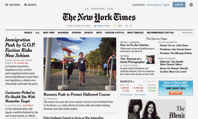
Today the New York Times officially announced the redesign of their website—a project they’ve been working on for the past several months. While there will definitely be commentary around it's launch and good vs. bad changes, there is one key feature we feel all businesses looking to rebuild their websites in the near future should pay special attention to: they’ve engineered evolution into their site design.

"We have completely replatformed the whole back-end technology system so that we can get out of the business of doing redesigns," Denise Warren executive vice president, digital products and services group at The New York Times told Fast Company.

On the same note, I recently attended An Event Apart, a web conference for designers held in San Francisco. One of the key points raised by multiple well-known speakers at the event (including Jeffrey Zeldman, Luke Wroblewski, Ethan Marcotte and Karen McCrae) was the idea of preparing for online iteration. We believe this supports the idea that websites are no longer “corporate brochures”, but organic organizational tools—to help support and grow business and connect with customers. Not only are websites never perfect, but they are often out of date at launch. We must build a more modular approach that will easily evolve as priorities and messages change.

For the New York Times, this focus on site evolution allows them to be flexible. "We can continually iterate on the site and take advantages of the trends as we see them happening,rather than having to do a big unveil," Warren explains. As a result, she says, readers will see more incremental changes over time, rather than a big unveil a few years down the line.

At Zync, we’re currently helping clients like speakers.ca and olympic.ca evolve their sites on an ongoing basis. Right from the initial planning stages, we understood their content would need to be adjusted—and we built websites and Content Management Systems that were prepared for that. We’re embracing evolution and future-proofing our clients’ sites.

November 9, 2011No Comments

Zync is responsive

In the field of web design and development, we are at a point where it is impractical – financially and otherwise – for any business to attempt to keep up with the seemingly endless amount of new devices coming to market.

So, we started asking questions: Should a business suffer the consequences of alienating users of one device for the benefit of gaining them on another? Or, must we continuously develop website versions to cover the requirements of each device?

We knew there had to be a better solution. This challenge, and the answers discovered, led to an approach called Responsive Web Design (a term that originated in an article by Ethan Marcotte) – instead of a device reacting to a website, the website can now react to the device. As users switch from one type of hardware (desktop, laptop, tablet or smartphone) to another, the website automatically adjusts itself to accommodate for resolution, image size and scripting abilities. This functionality is accomplished through a mix of flexible grids and layouts, images and an intelligent use of CSS media queries. We now have the technology to automatically respond to the user’s preferences, eliminating the need for a different design and development phase for each new gadget on the market. It’s a much more cost-effective and practical solution.

In order to fully engage our team in Responsive Web Design – and our strong belief in this approach – Zync recently overhauled our own website at zync.ca to take full advantage of HTML5 and its capabilities. Depending on what type of device you use, you’ll notice some subtle differences: adjustments to the navigation structure, column widths, type size and the ability to control the site by mouse or by touch. We even made sure to take full advantage of the devices – for example, elevating the directional map to the home screen of the smartphone version to recognize it’s importance when our users are on-the-go. All elements are customized to enhance the experience and allow for optimal viewing on any device – even though it is all part of a single website.

The growth of new products is not expected to slow down anytime soon. And, I believe in creating websites that are future-ready, now. Understanding and being able to apply responsive design is key to operating in this reality. Through researching the market and building our own site, we are now able to provide our clients solutions that keep them current and relevant – and save them significantly in their online budgets.