May 27, 2014Comments are off for this post.

The basement bar is just an improved hamburger menu

Recently, an article by Luis Abreu entitled “Why and How to avoid Hamburger Menus” surfaced within my personal Twitter feed. As a regular advocate for this type of navigation, the title immediately set off alarm bells inside my head, begging the question:

Have I been recommending the wrong website navigation experience to our clients and their customers all this time?

After reading the article, I immediately did what any good person who thinks they have wronged the world does. I began to research the heck out of it.

What I constantly found, was that while everyone could quickly write about what isn’t working for online navigation, no one could quite put their finger on what the right solution should be.

The best answer I found was the recommendation of the so-called “basement bar.”

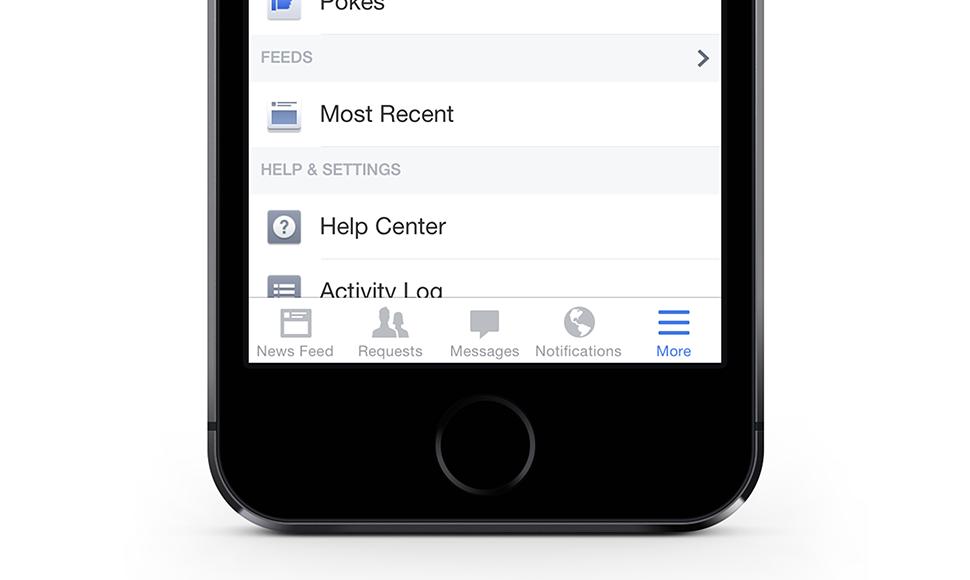
For those unfamiliar, this is the treatment Facebook is currently using within their mobile app. It positions a five tab navigation bar along the bottom of the screen that allows the user to toggle between Facebook’s key sections — News Feed, Requests, Messages and Notifications.

However, as Evan Dinsmore, designer at Shopify writes here (and I completely agree,) “A lot of times you can’t break down the IA enough to fit in a tab bar.”

And that’s why Facebook reserved the final spot within their tab bar for a “more” button. (Which in my opinion still constitutes, you guessed it, a Hamburger Menu!)

This leads to why I felt this piece needed to be written. Hamburger Menu and Basement Bar naming aside, what we as UX designers have to understand with any solution we propose is that some clients will never be able to narrow their IA down to four navigation items. This is a crucial point as we move forward with trying to improve the online navigation experience.

What the Facebook example shows is that we can improve on the original Hamburger Menu option by working directly with our clients to highlight a few key entry-points that can help drive the user to where we think they would want to go more quickly.

The good news? This idea can be completely scalable. For example, a desktop version could highlight eight entry points, the mobile version only four, both providing a similar user experience while training the user to know where to look for any additional sections.

But we don’t have a cool name for that yet…

November 12, 2013Comments are off for this post.

Content First

The primary reason people go online is to consume content. To read news, look at status updates, view photos, read restaurant reviews, look at credit card spending habits — always to learn about something that interests them.

So why aren't companies putting content first when building new websites?

When it comes to website planning, we already know that we should focus on user experience and apply the best web technologies to meet the needs of our user. However, what’s missing is the importance of content and the creation of a comprehensive and unified strategy surrounding it.

Ideally, before a web project moves from site map approval into the wireframe/prototyping stage, the content should be completely mapped out. Understanding content types will help the UX team use the appropriate tools (placement on the page, visuals, type size etc.) to get the messages out.

Currently, we are seeing the discussion about web content often limited to who will be in charge of it. In the best situations there may also be talk around SEO and the inclusion of social media feeds. Most of the time, that's it. And that is not enough.

Questions need to be asked around the purpose of the website and what makes the company different. Is there existing content? Does the copy need to updated, edited, or in most situations dramatically condensed? After these questions are answered, all the different content types that will live on the website should be analyzed for a structured taxonomy that will in turn drive functionality.

This gives the website the ability to dynamically generate related information across all pages, allowing a company to "cross-sell" material the user might never have known existed.

An example of this can be seen within the @zyncagency recent rebuild of the Canadian Olympic Committee responsive website: Olympic.ca. Users immediately get access to information about the Sochi 2014 Winter Games, the athletes, the official twitter feed, as well as related stories and videos. A keyword tagging system offers up relevant dynamic content throughout the site based what the user is looking at.

Today, Websites are dynamic and fresh. They need to be easy for people to update with new content on a regular basis. With a well thought out content strategy, websites can meet the needs of the user and keep them coming back for more.